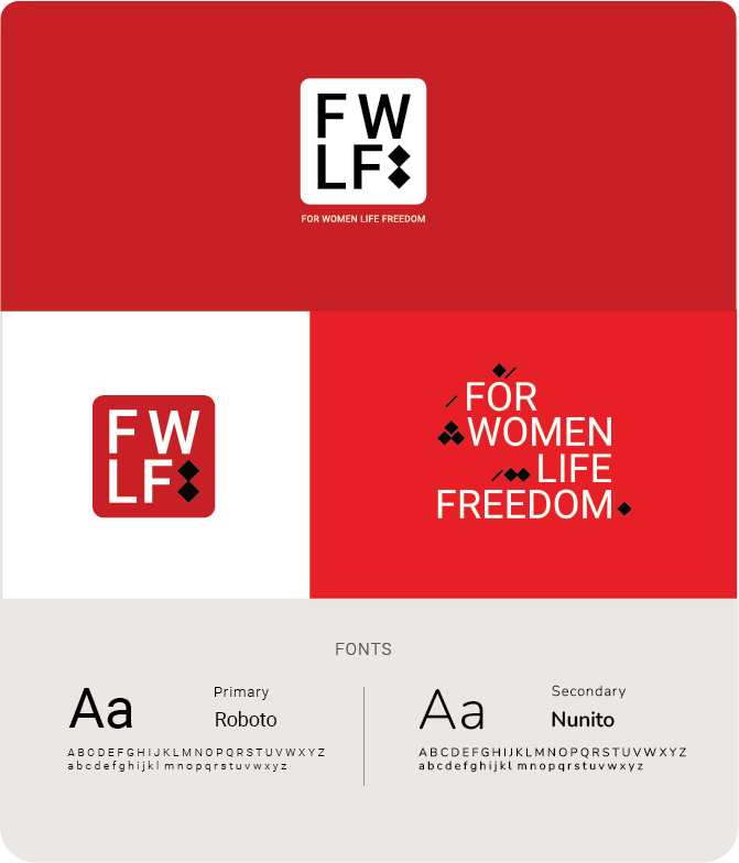
For Women, Life, Freedom
Client :
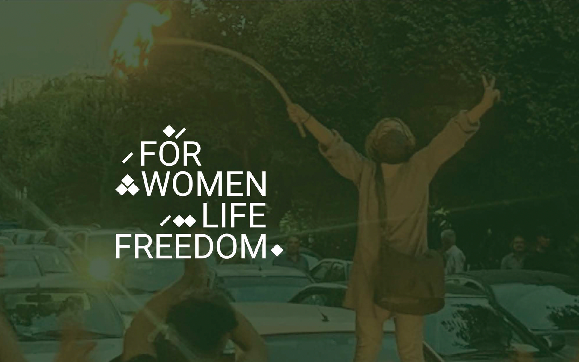
"For Women Life Freedom" organization was formed to be a platform for unified support of the humanitarian crisis unfolding in Iran. Made up of business leaders, influencers, activists, and artists, both inside and outside of the Persian and Iranian communities, the group is committed to using their platforms and influence to elevate awareness and support the movement for a free Iran.
Client Challenge :
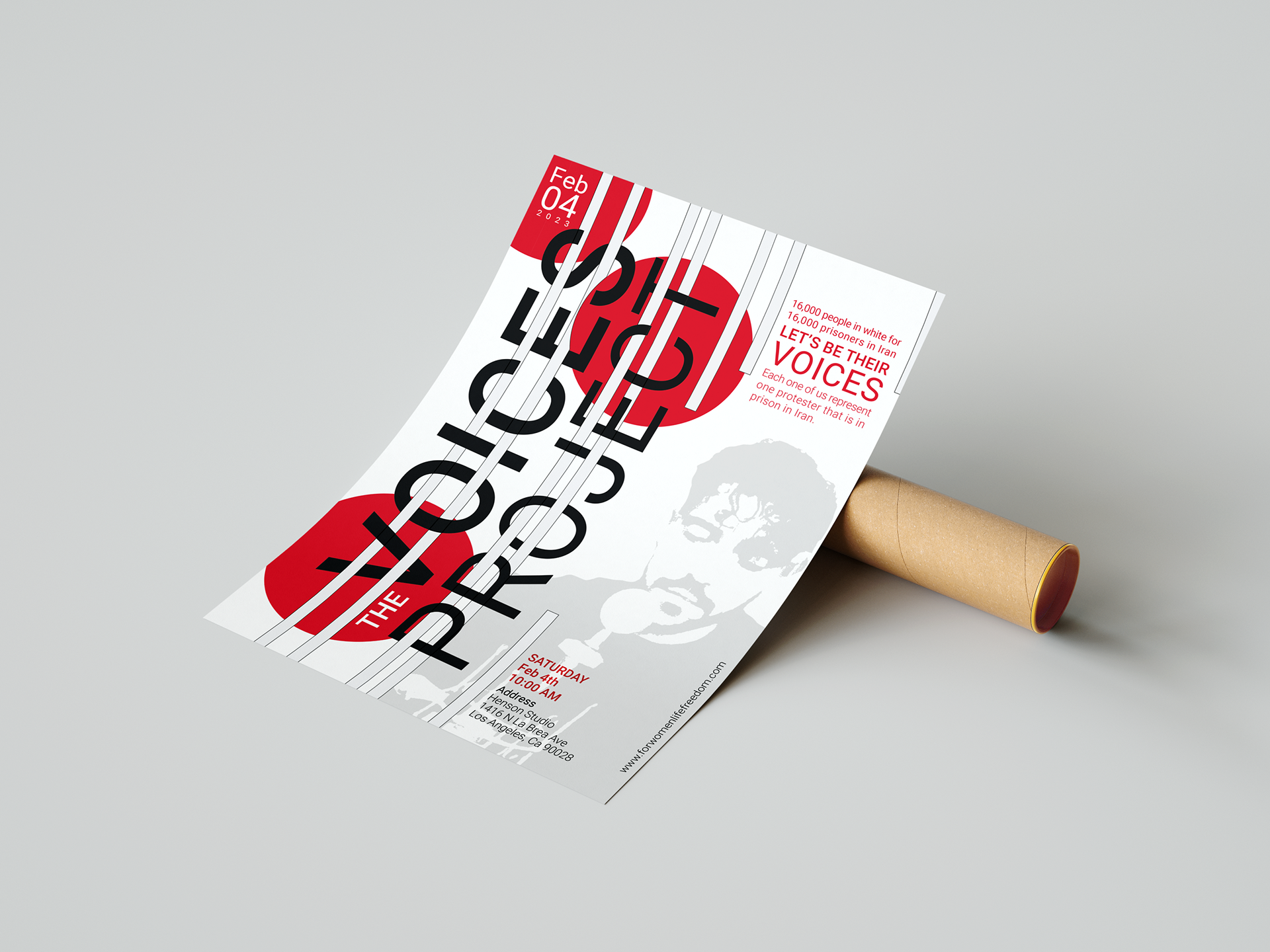
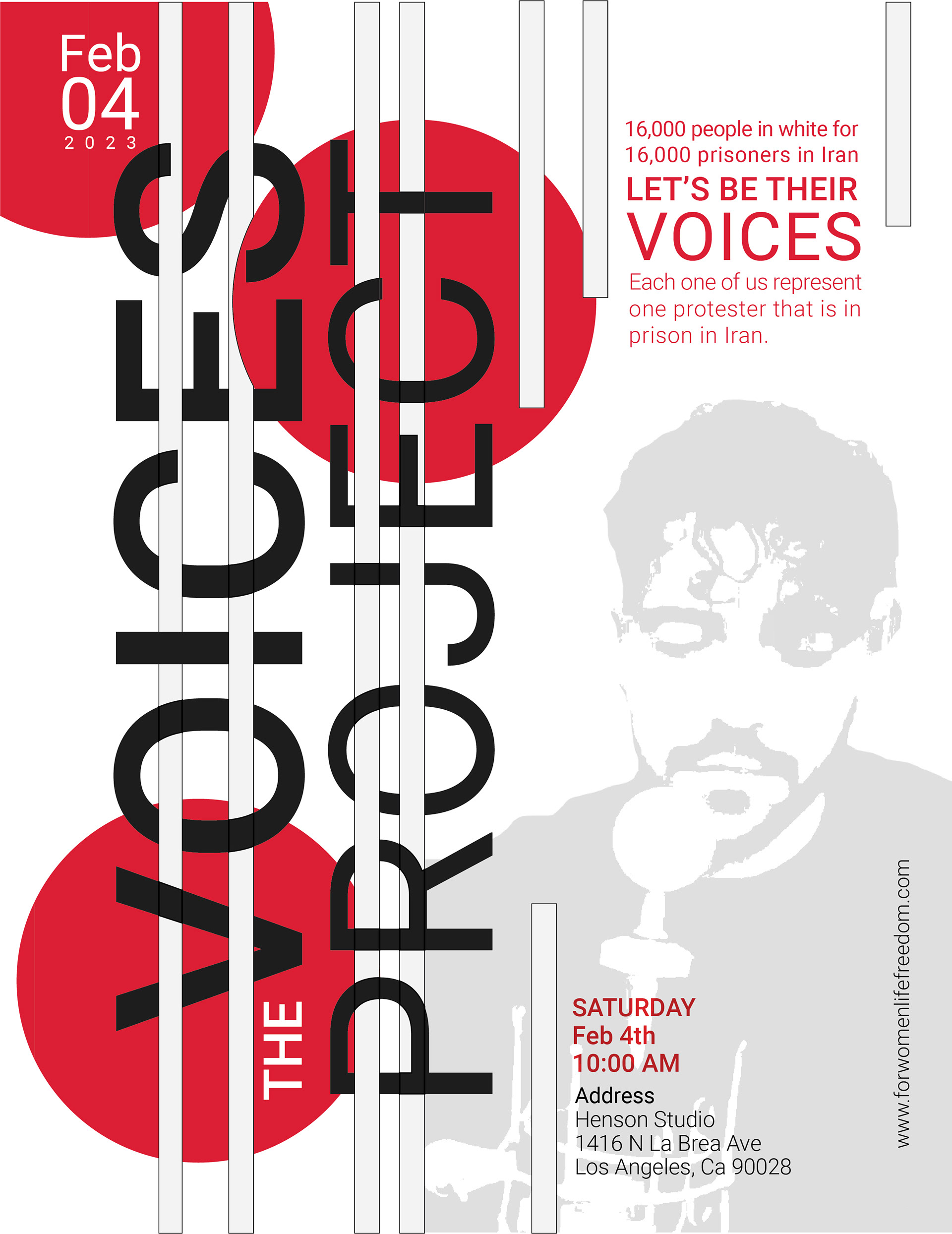
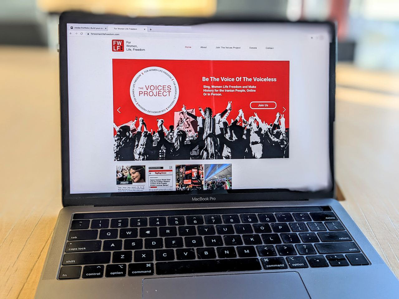
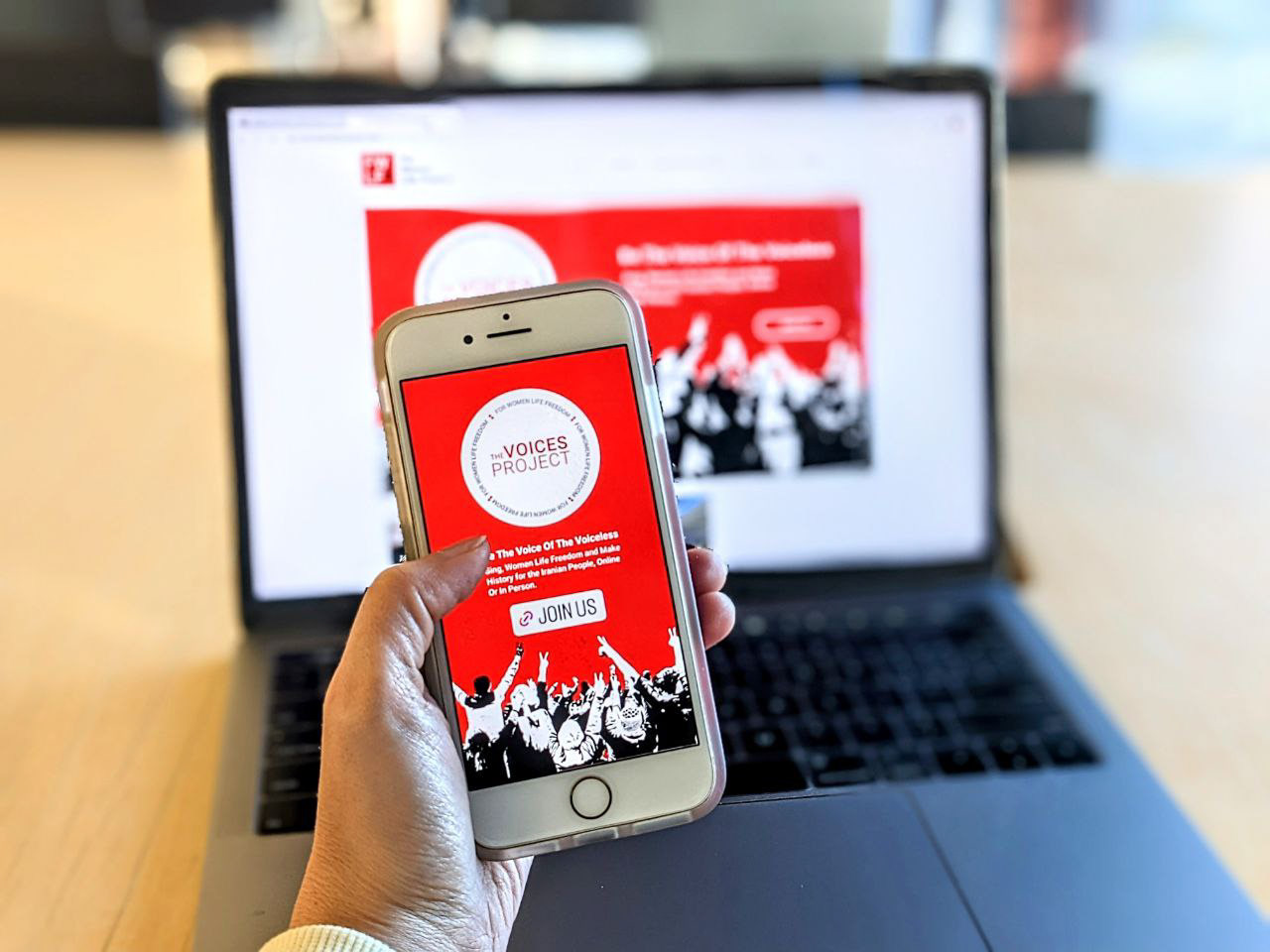
They wanted to build the identity of their organization, and they were looking for a designer rooted in Persian culture to understand the vital need for this branding. Also, they planned a big event called The Voices Project to gather 16,000 people in Henson Studio in Los Angeles to sign a song based on an Iranian singer piece to show their support and be the Iranian people's voice. They wanted to announce this event on their website and other social media platform and encourage people to join.
Solution :
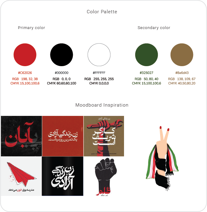
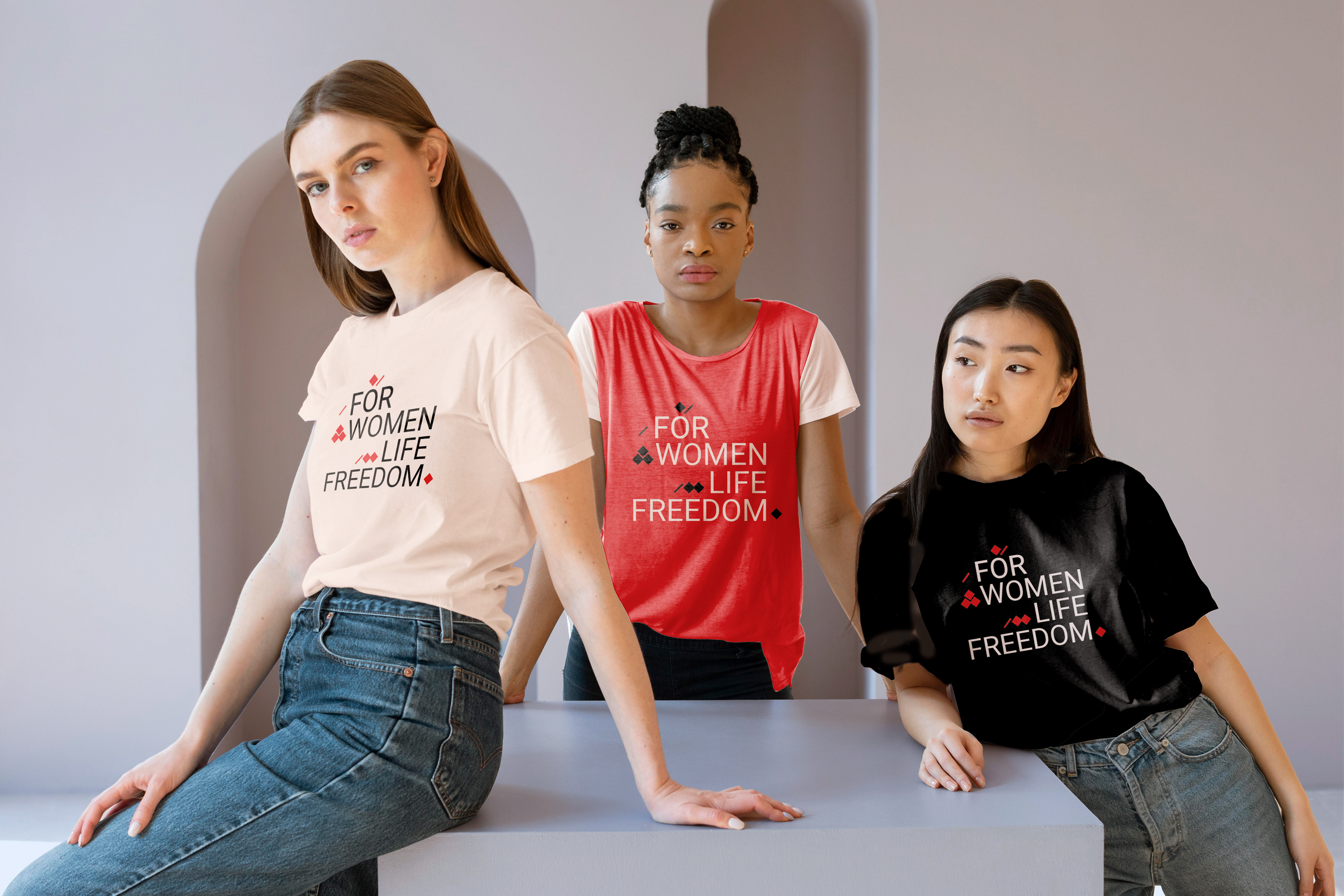
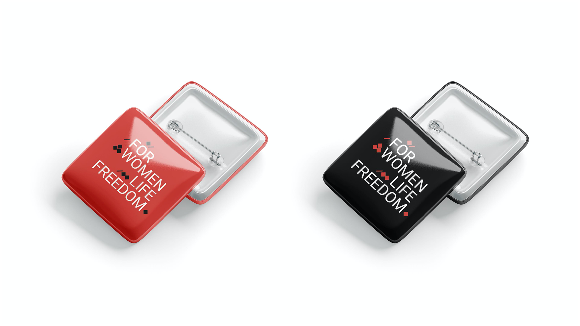
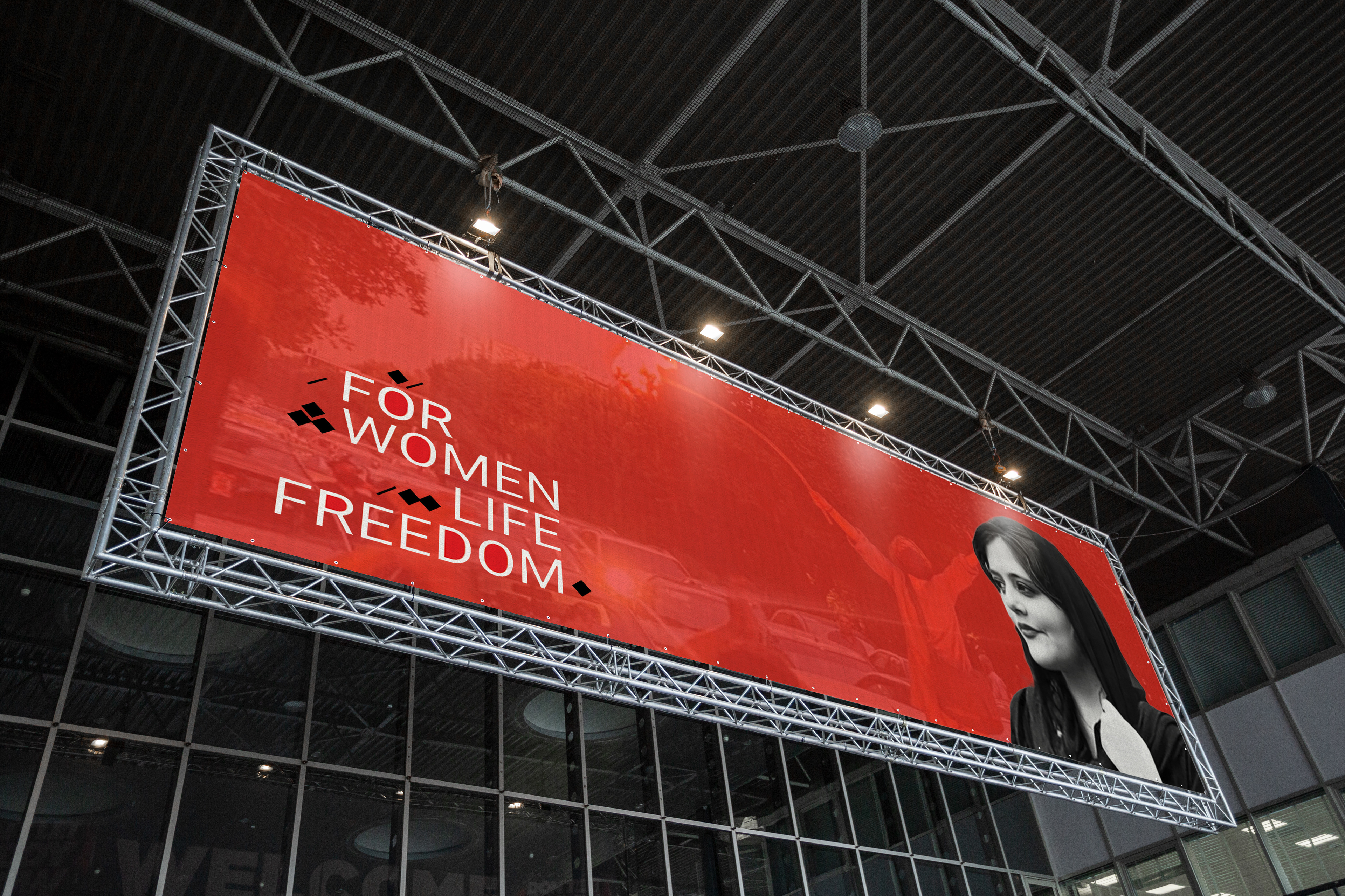
Researched and empathized with people in Iran and Iranian culture. I Selected red, black, and white for the color pallet, which reflects the revolution and protest. For the logo, I incorporate the element from the Persian calligraphy, "dots," with the English letters to reflect the connection and support. For the campaign, I designed an IG post, Website banner, and poster to share.
My Role :
- Graphic designer
- Brand identity designer
- Part of the campaign design team


Ozark Beer Co.
New Summer Specialty Launch
Client:
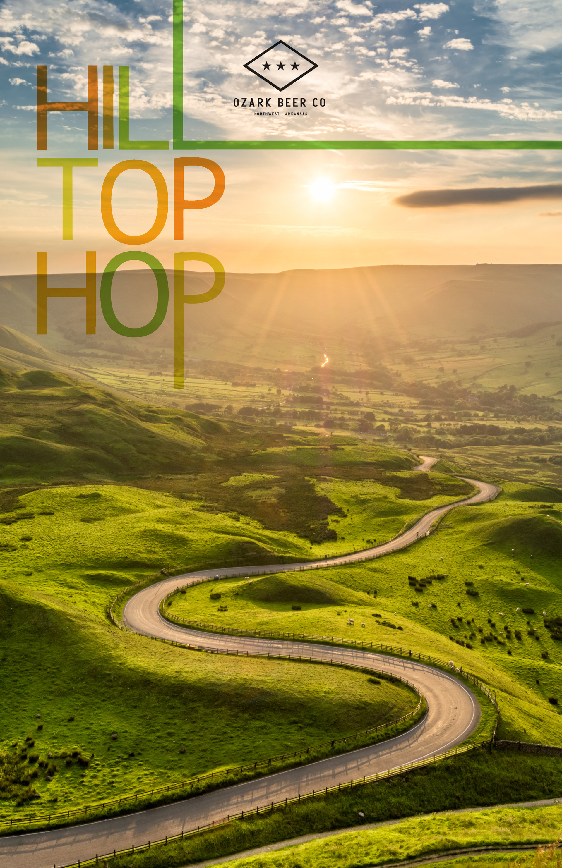
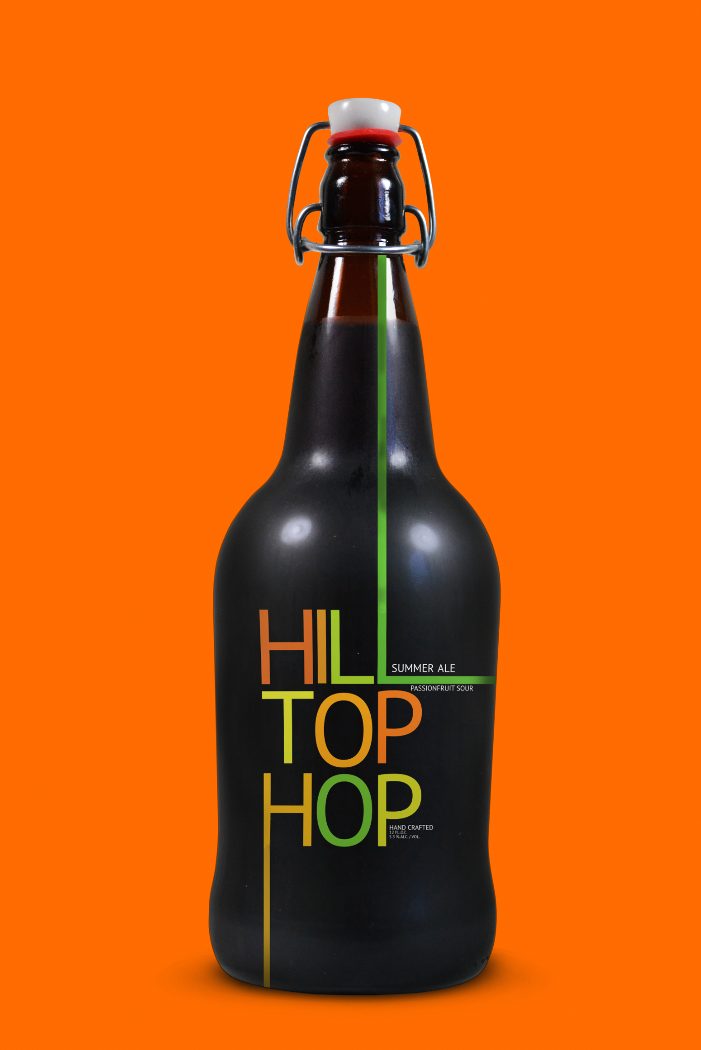
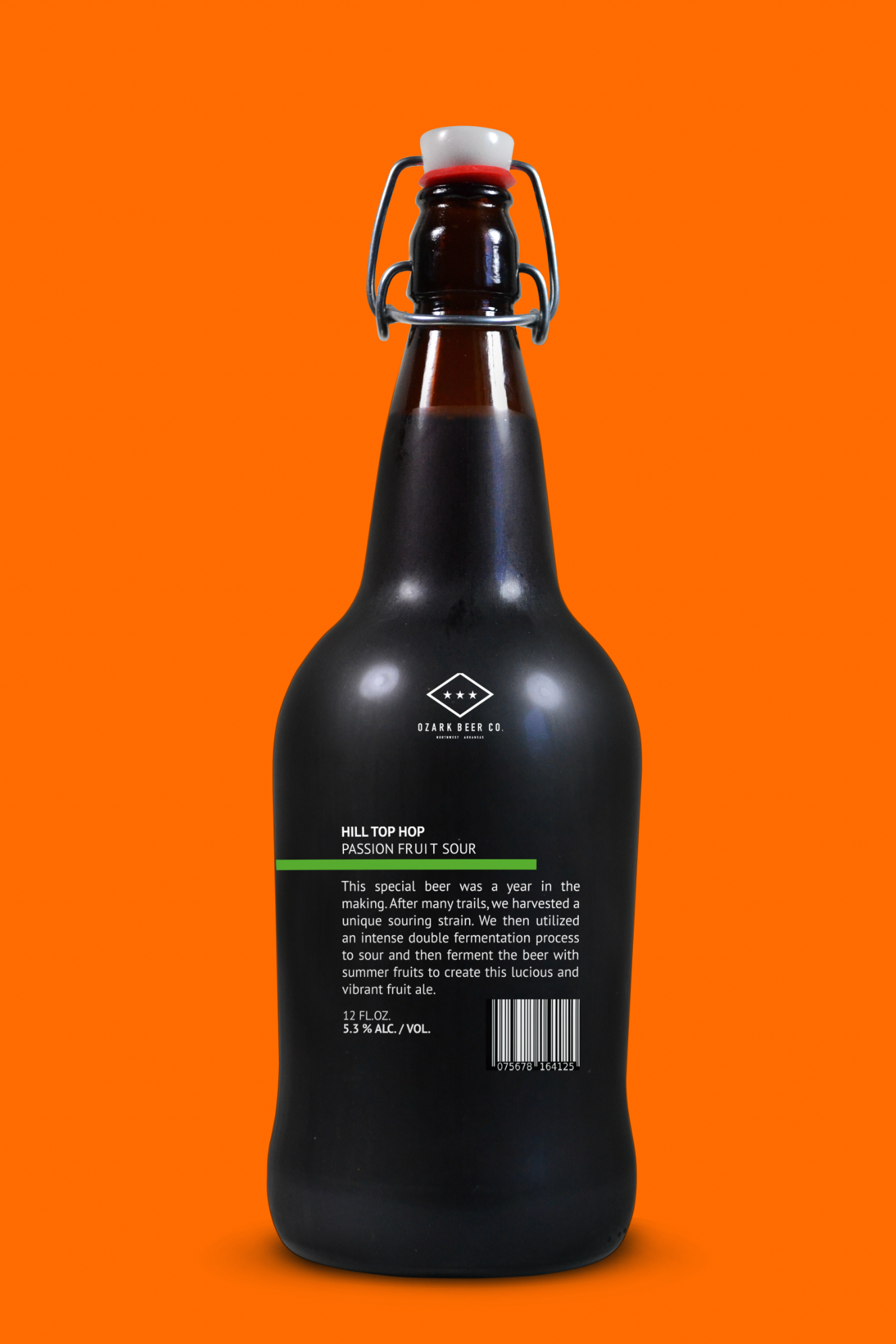
Ozark Beer Company is Founded in 2013, they are located in downtown Rogers, Arkansas. They produce a variety of year-round and seasonal beers offered in pints, flights, growlers and cans to go. The makers of Ozark Beer Co., Lacie Bray and Andy Coates, have been on a constant journey together for many years. After many adventures and new locations throughout the States, Lacie chose their next adventure to South America. Their travels to South America became the theme for this new summer brew brand.
Client Challenge:
They wanted to pick a name for their new Summer specialty beer lunch and build up the brand identity for that based on their story. They did not know how can study and how they could keep brand Identity in different media.
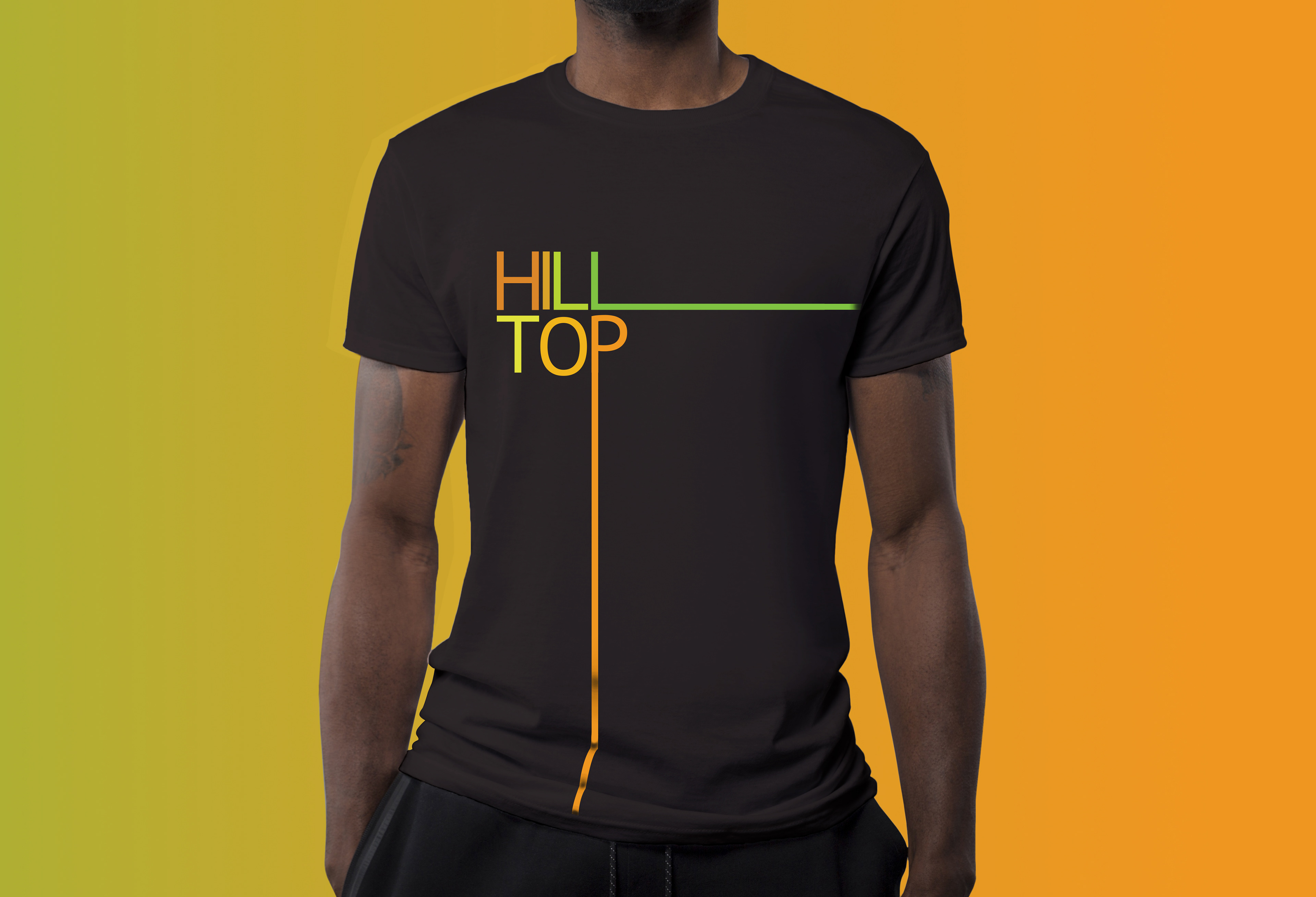
Solution:
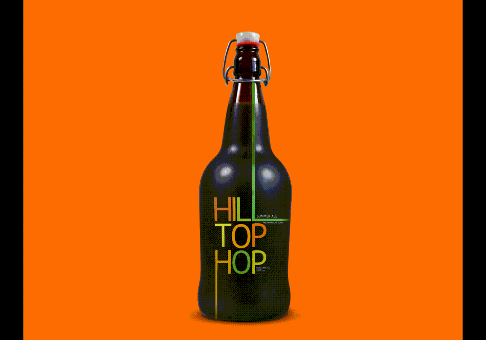
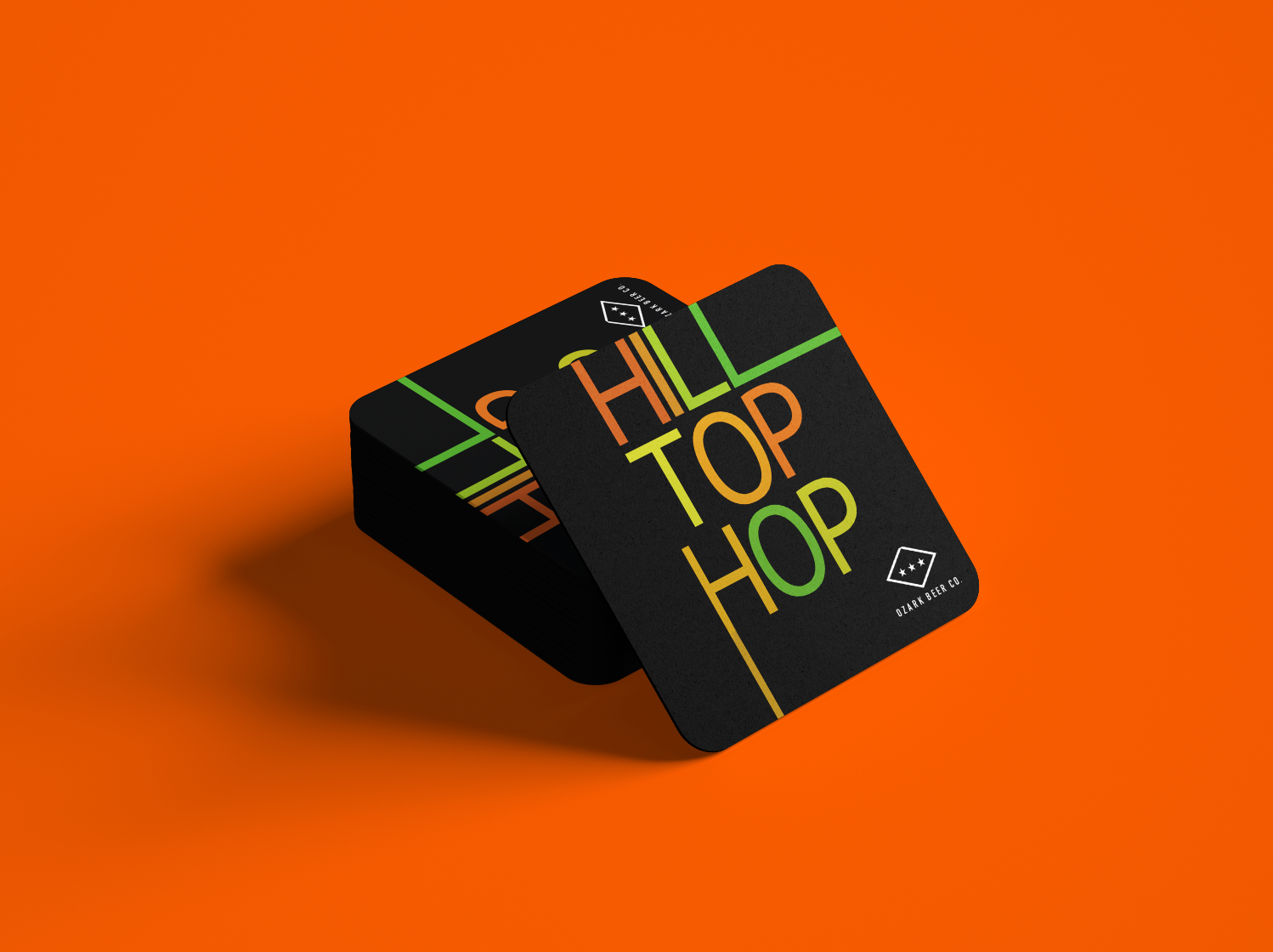
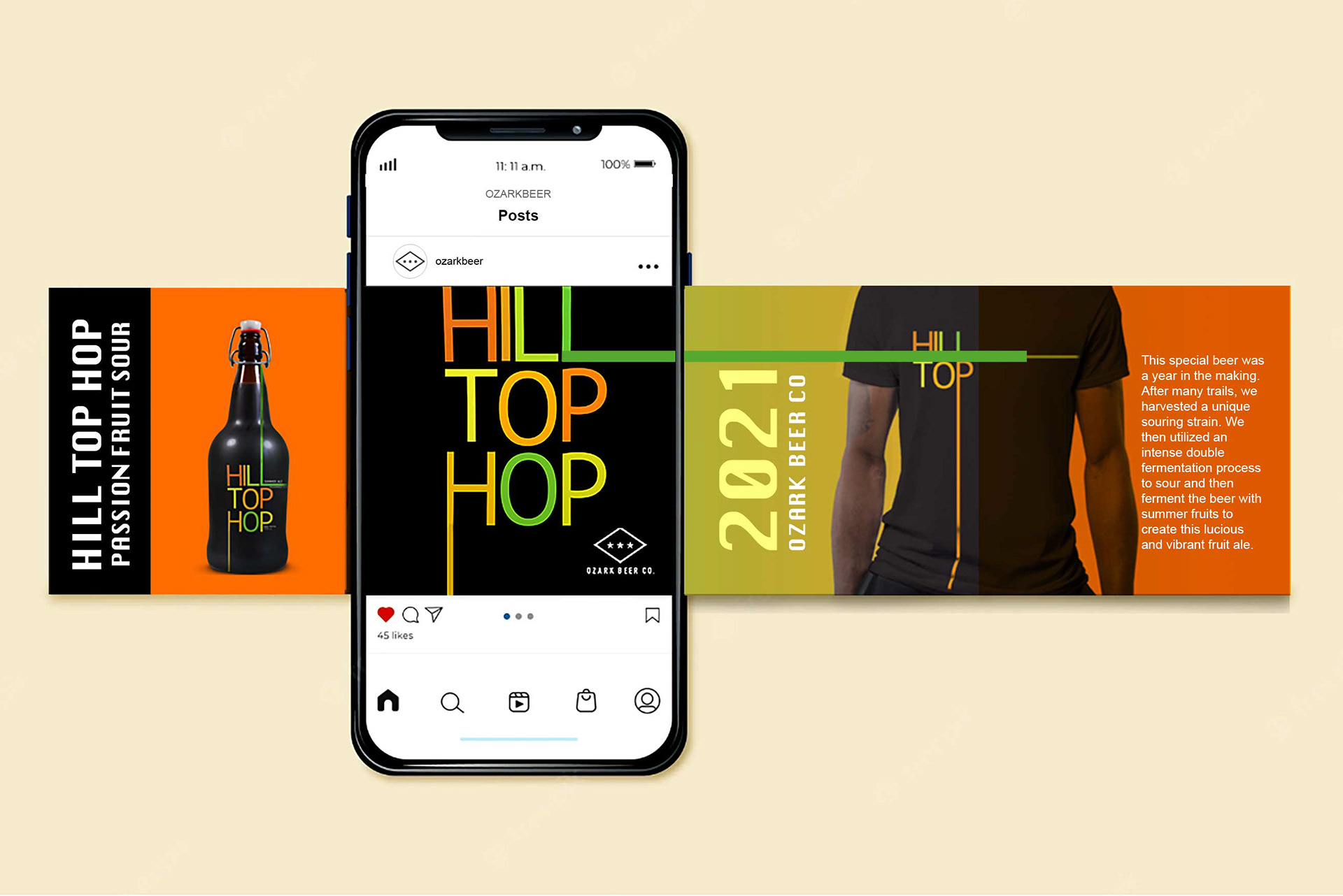
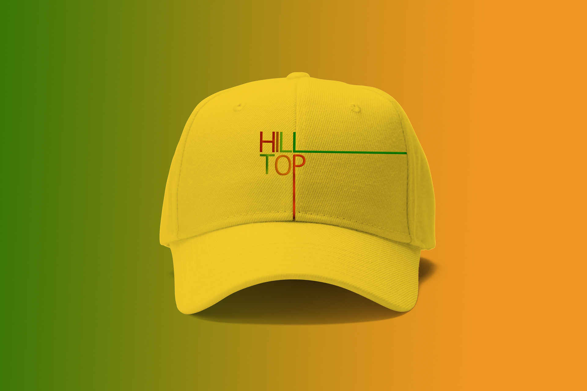
For this project, I aimed to capture their story and adventure to incorporate it into a beer name and visuals. I named the beer Hill Top Hop. The extended lines used in typography are inspired by road trips and traveling, and the color pallet reflects the summer, fruity flavor, entertainment, and adventure. Then I designed their social media posts, motion design for the product, and some promotional materials.
My Role:
- Graphic Designer

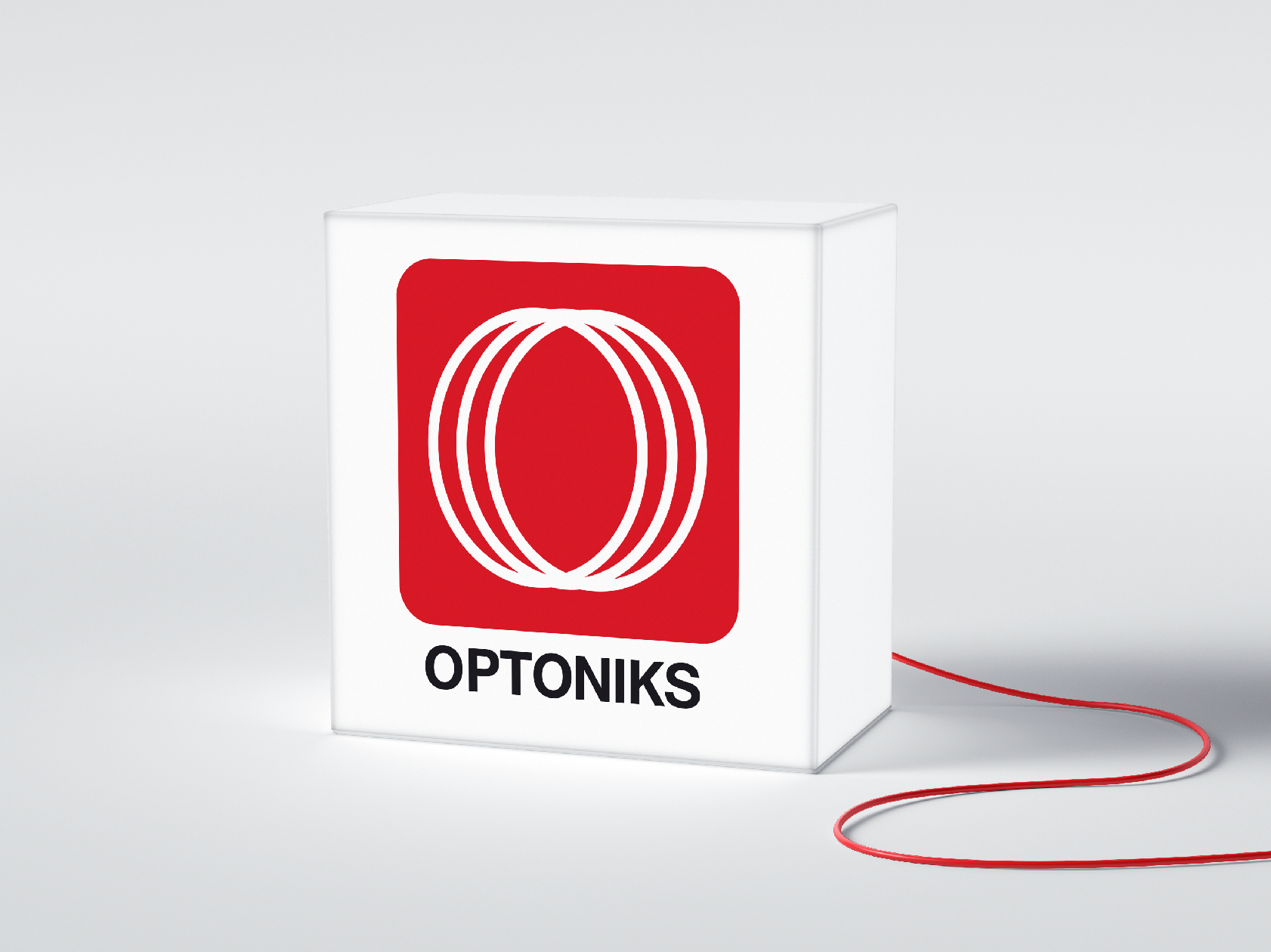
Optoniks
Client :
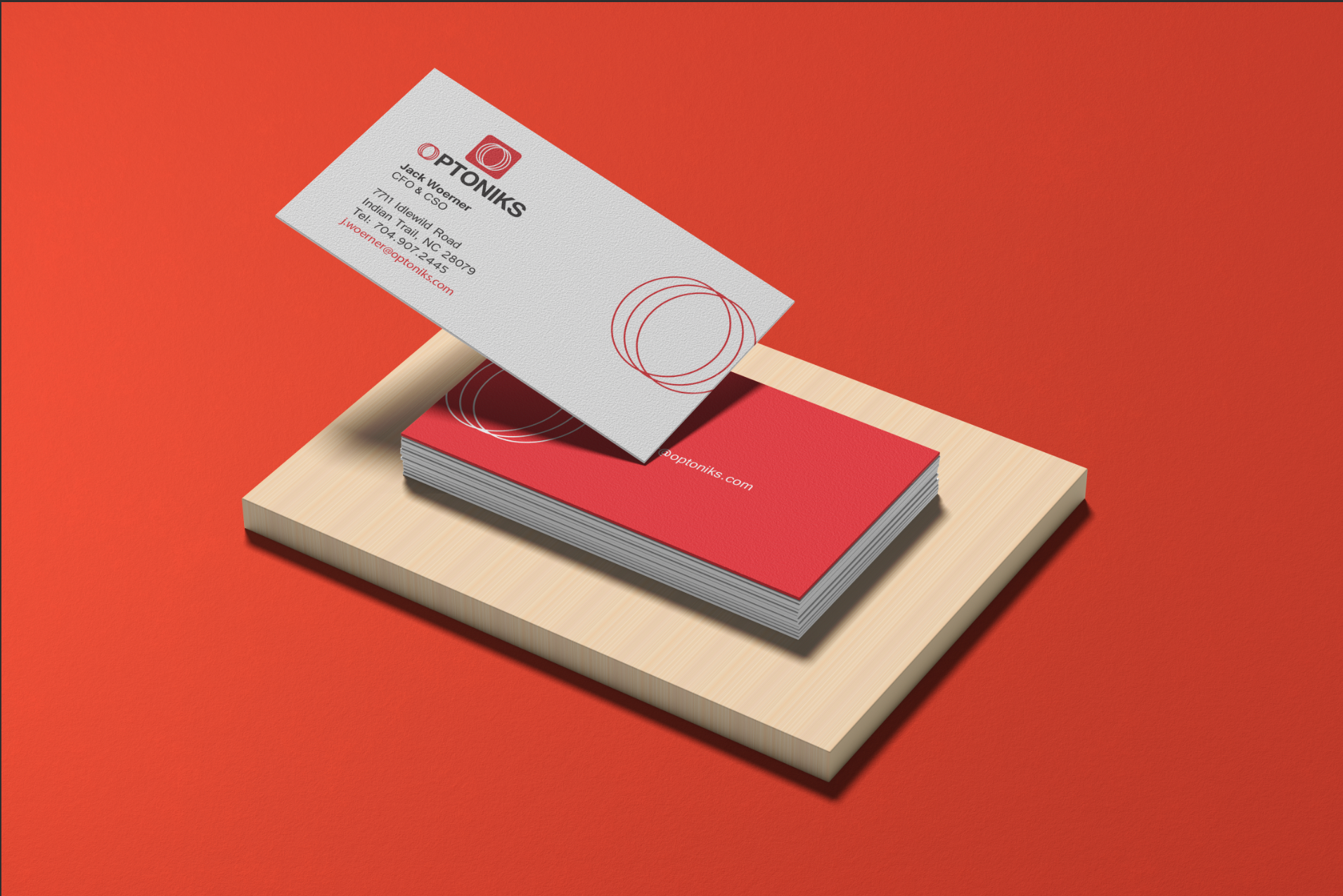
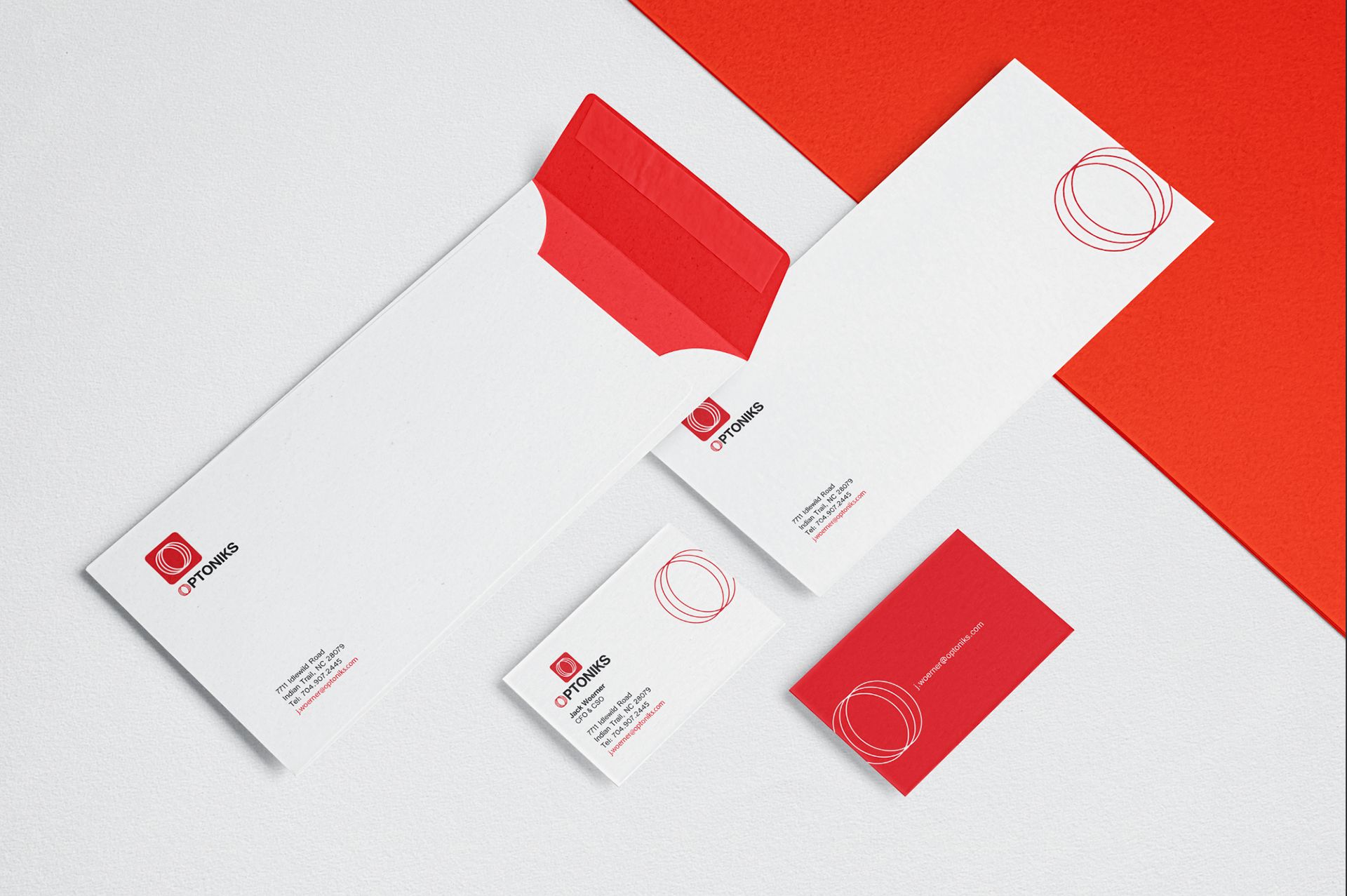
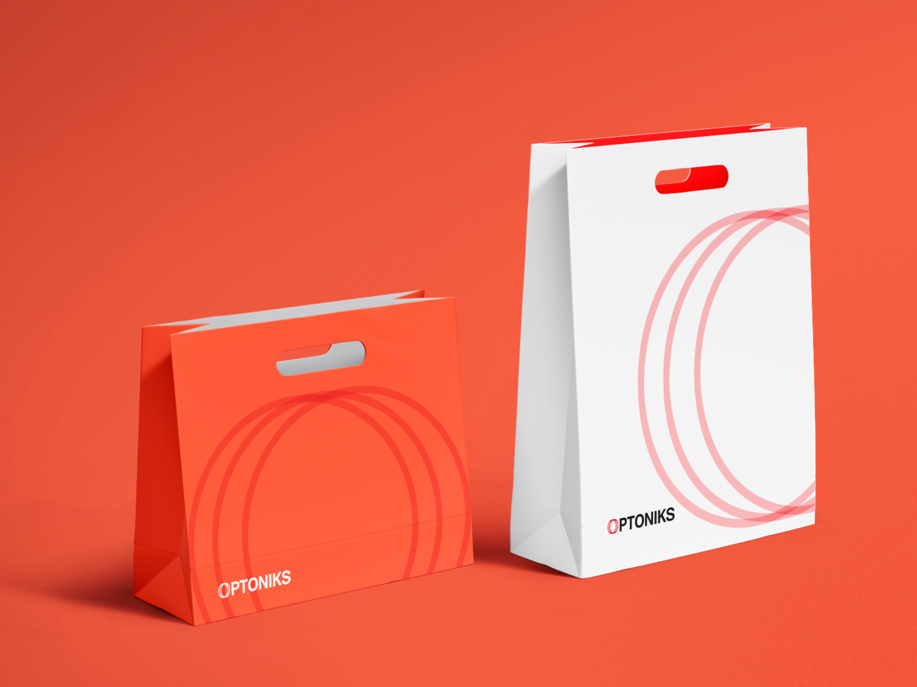
Optoniks is a precision optical engineering company based on Charlotte, NC. They focused on highly accurate dimensional inspection solutions to improve real-time quality control and facilitate greater automation of the industrial manufacturing process.
Client Challenge :
They did not have any brand identity and tried to raise funding for their projects since it's a start-up company. So to be a trusted company for their investors and be official, they wanted to build an identity design for their company.
Solution:
Designed Logo and brand identity, using red color inspired by the company's laser measuring tools for its products.
My Role :
- Graphic Designer
- Brand Designer


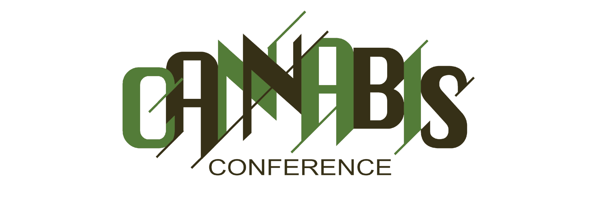
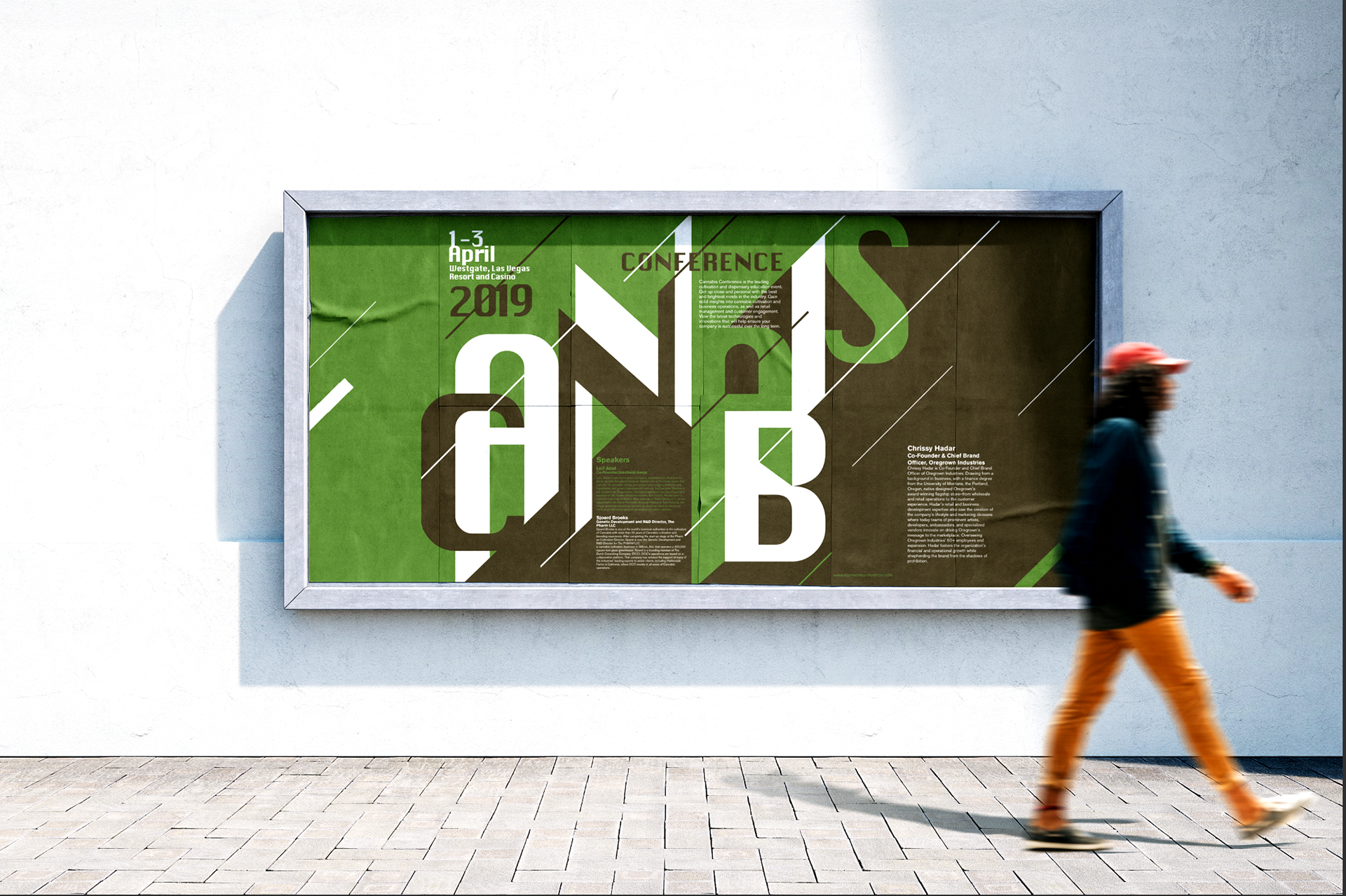
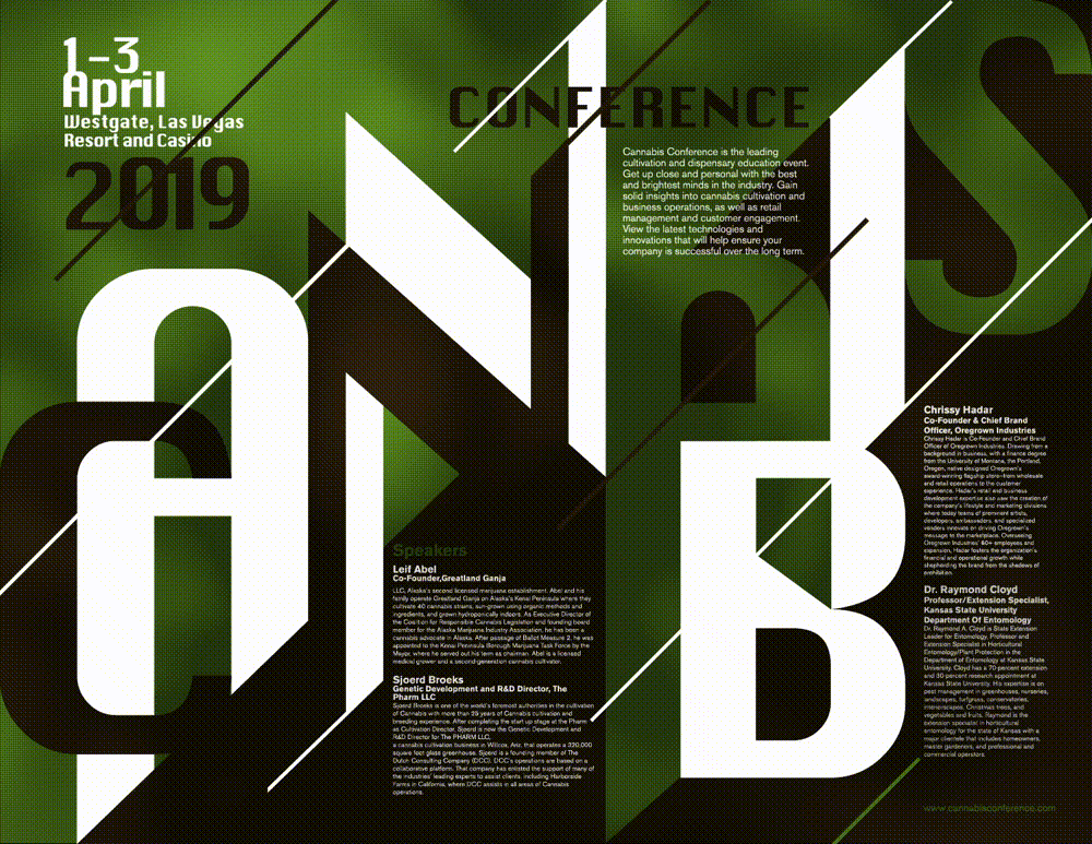
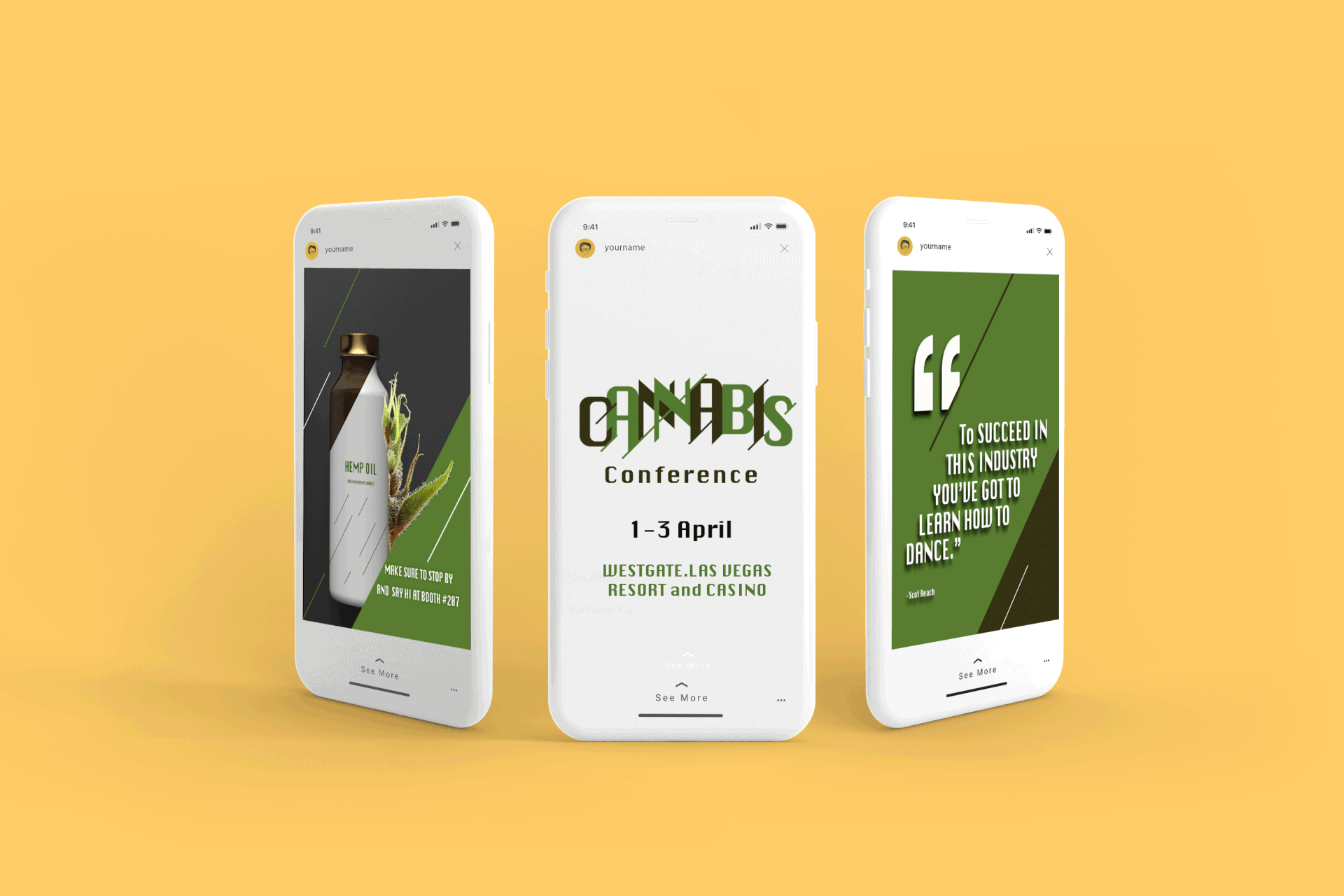
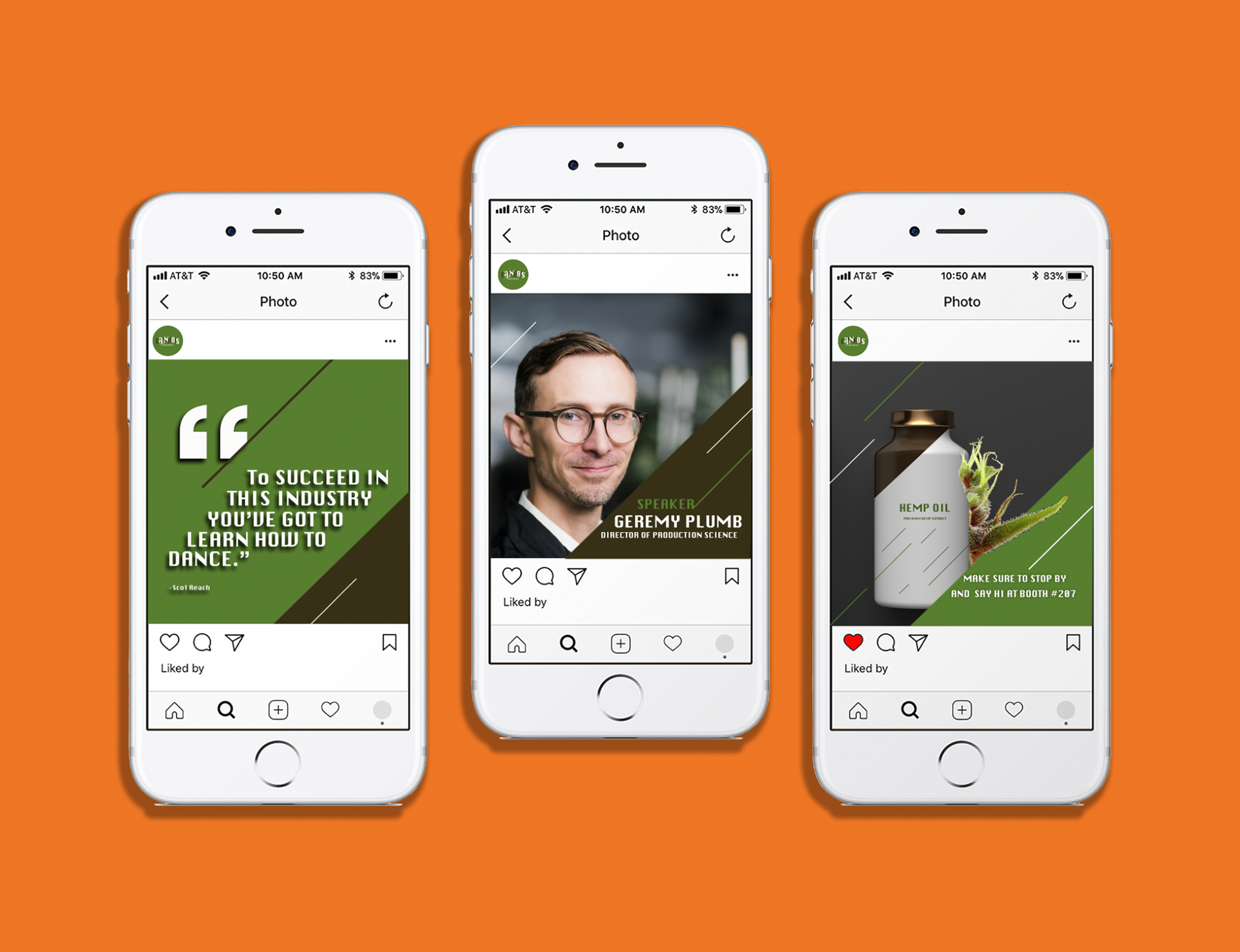
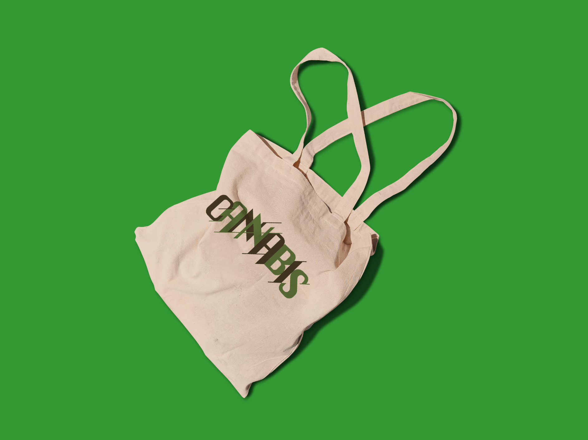
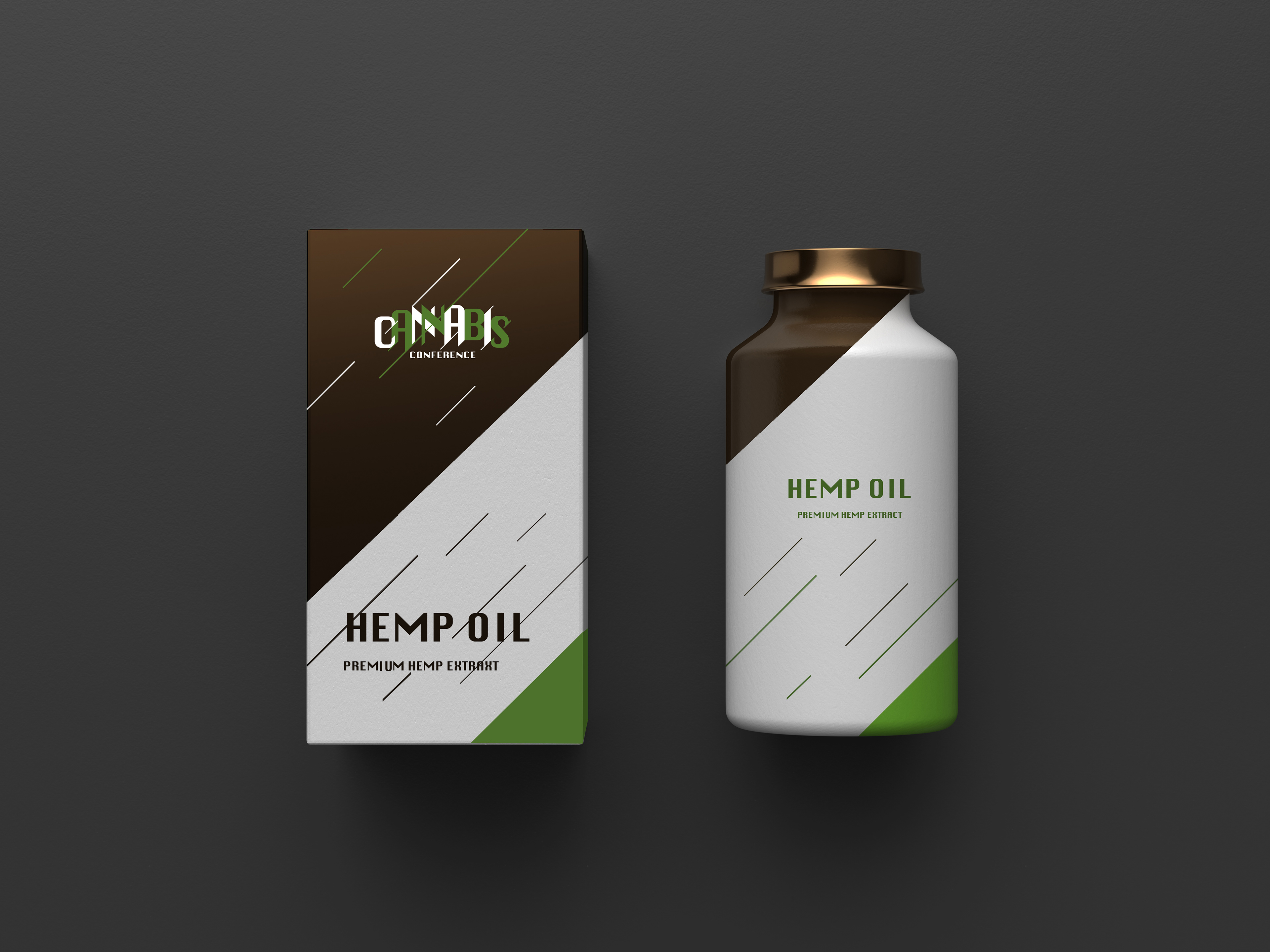
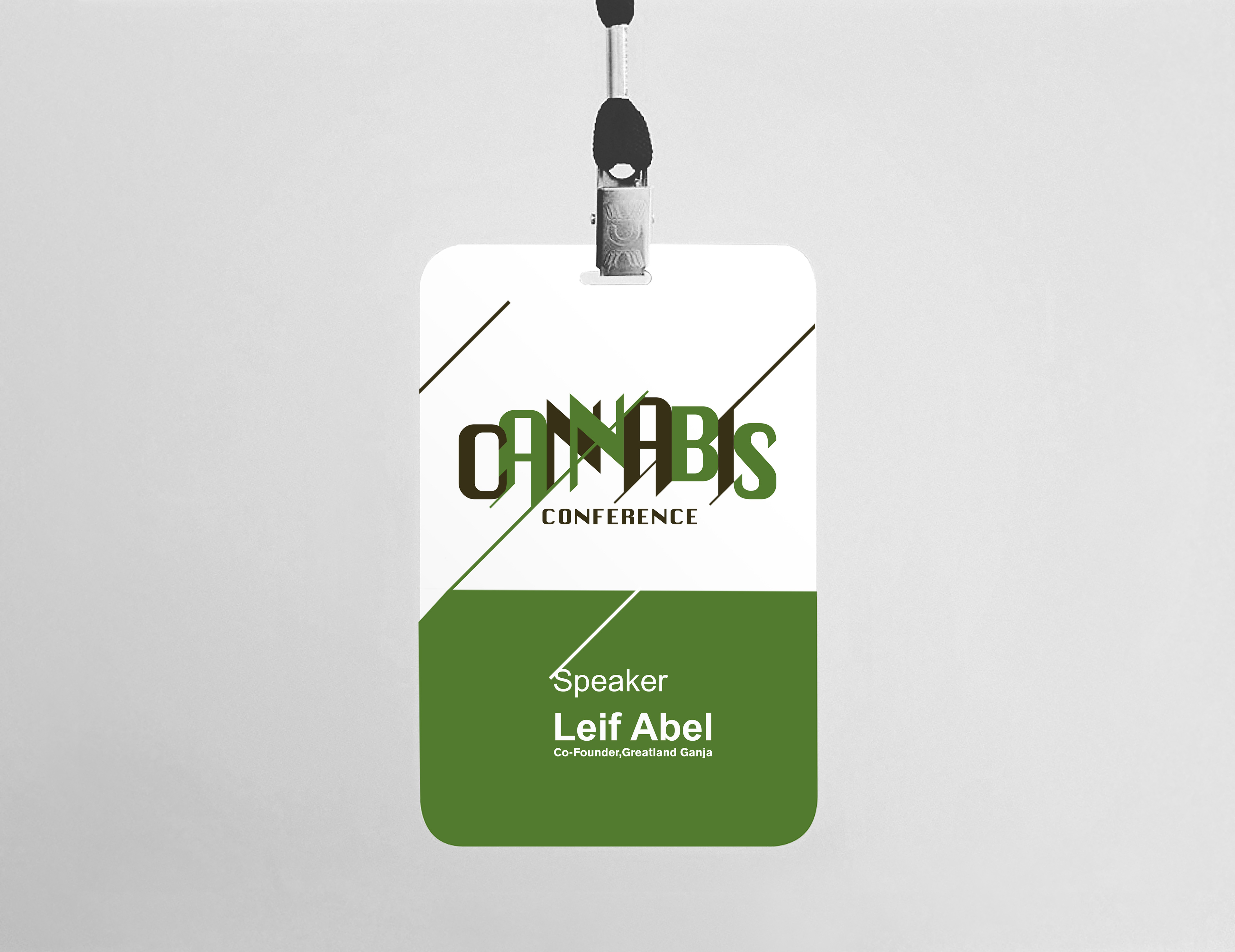
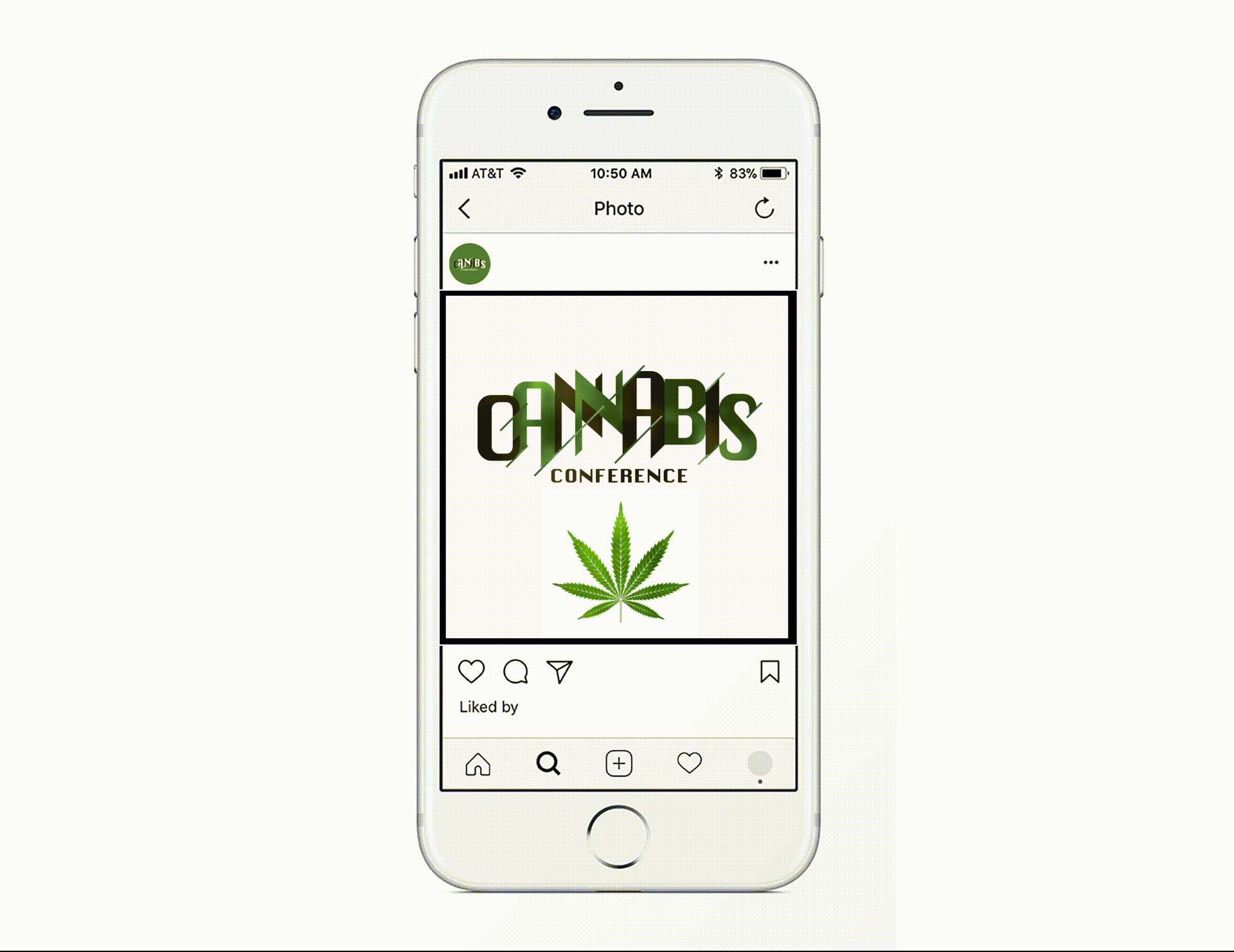
Cannabis Conference
Client :
The Cannabis Conference brings industry stakeholders
together to engage the most significant opportunities and
challenges facing the legal cannabis market.
My Role :
- Graphic Designer
- Packaging Designer
Solution:
For this conference, I designed the logo, Poster, Packaging,
social media promotions, and cardholder.